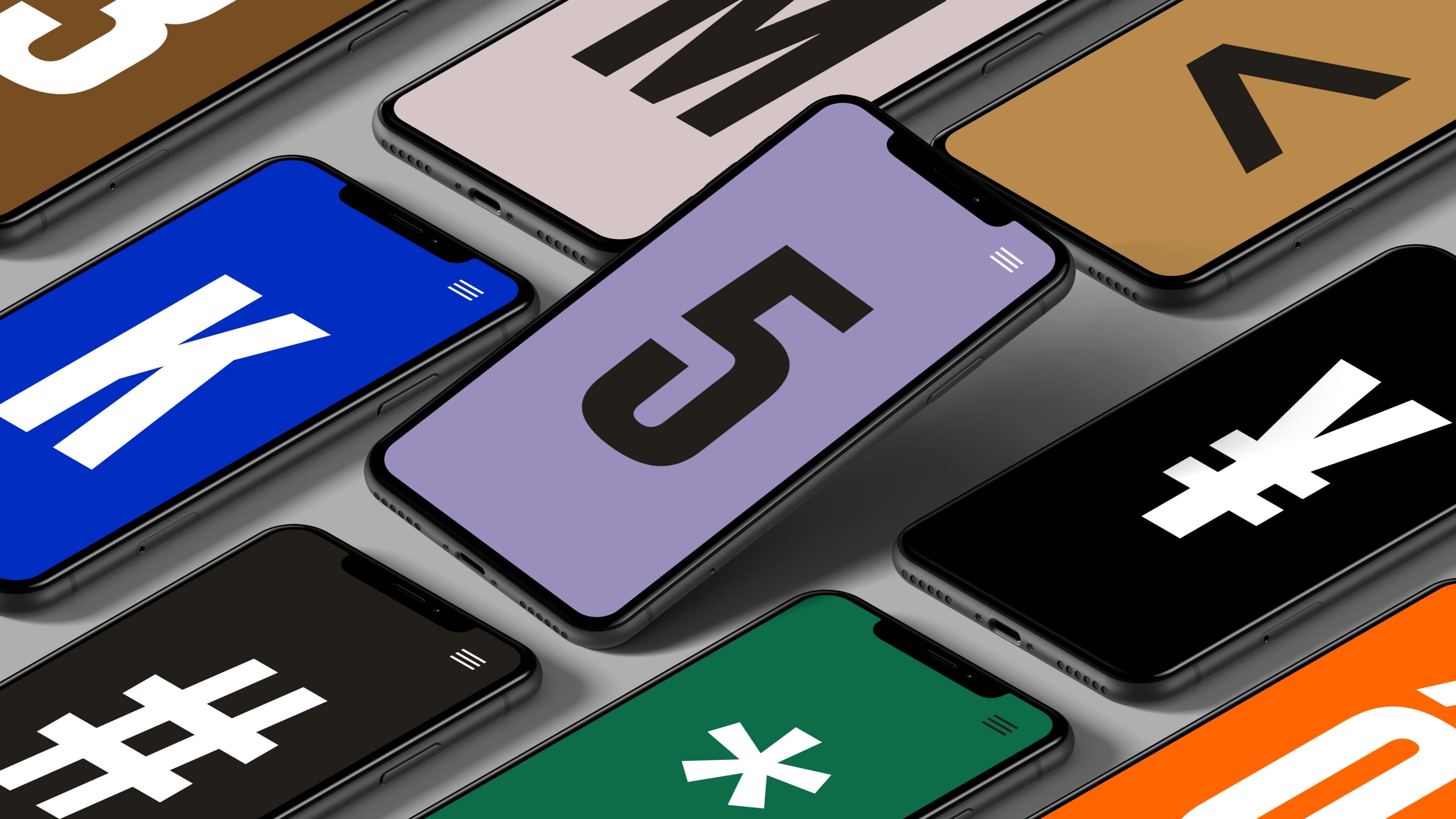
Bespoke Animated Typefaces
We offer a ‘custom type service’ for clients who are looking for a tailored solution. We work directly for brands and ad agencies, but are equally at home when collaborating with design or animation studios.
Our specialized team can create static and animated typefaces from scratch, or add animation to an existing typeface. The overlap in typography, motion and branding can be a powerful asset in any brand identity. Read up on our process and let's work together!
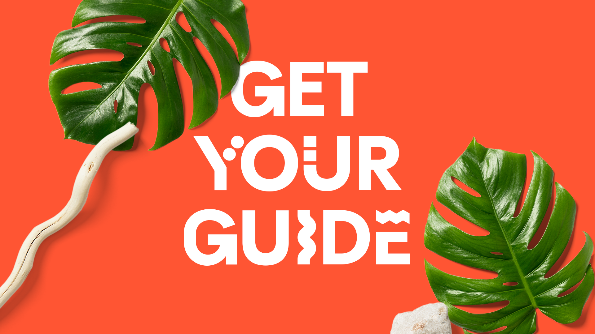
Get Your Guide
Description of your company, products, collections, and so on. There may be several paragraphs here.
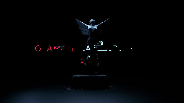
The Game Awards
Description of your company, products, collections, and so on. There may be several paragraphs here.
Natwest Bank
Description of your company, products, collections, and so on. There may be several paragraphs here.
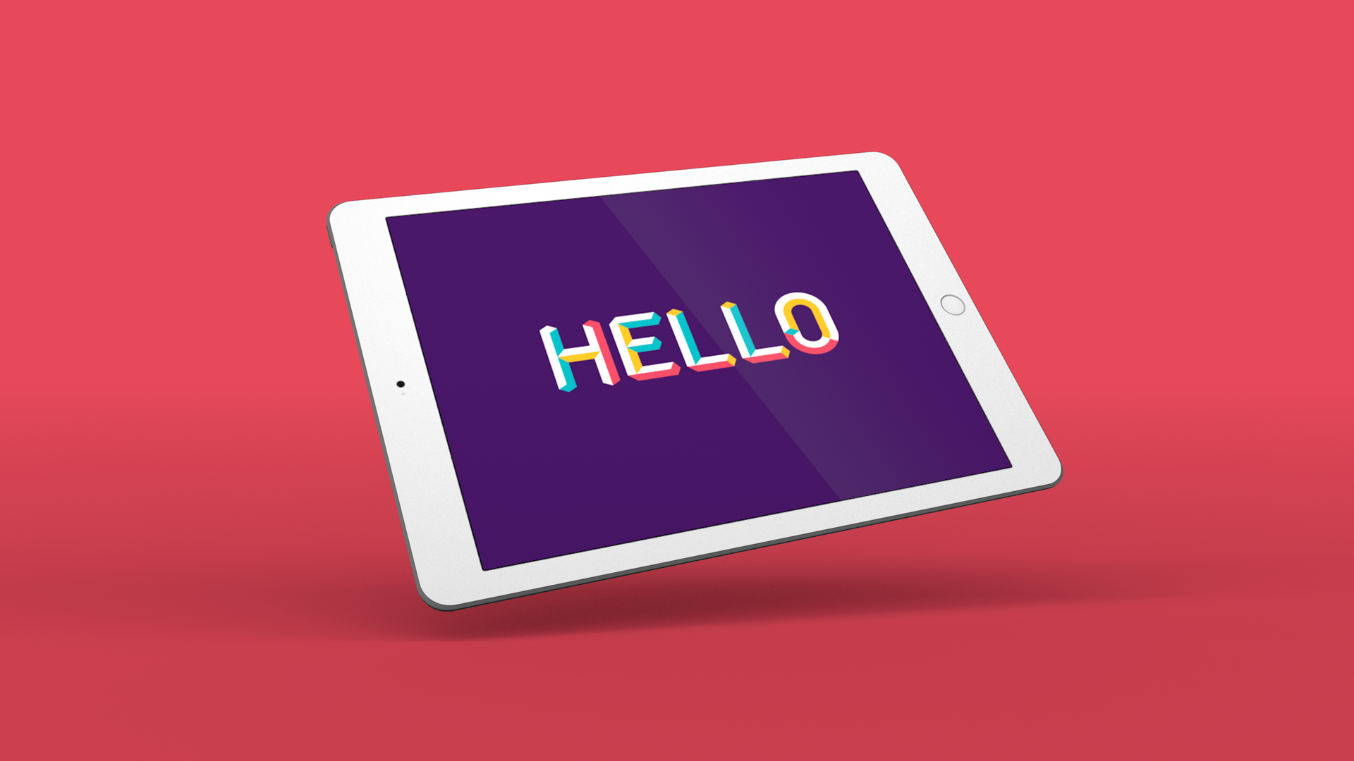
Aidsfonds
Description of your company, products, collections, and so on. There may be several paragraphs here.